About a month ago, we wrote about the different ways of dealing with serving the ever-increasing mobile traffic, and briefly introduced responsive design as a trending approach that deals with any device resolution universally and effectively.
Responsive design continues to get a lot of attention and it remains a wonderful tool, which unites the chaotic browser-based web and is making sites work best across devices and browsers.
Thinking responsively means building a user experience that delivers the best in all circumstances with the existing technology. For many teams this approach means learning a new way of designing and coding; but it also means adapting to a new way of content strategy.
Content strategy for responsive sites
As a responsive site adapts itself to various screen sizes the content needs to respond as well. This is what happens:
- It determines and varies the layout of the text according to the browser size
- It aims to preserve the same experience by dynamic transformation of font sizes, styles and line lengths
- It changes the structure of the build depending on the size of the window
And since responsive sites build on grids, which determine the layout of the content, these grids must be built before work on design can start. Knowing this, content (be it text or visual elements) definitely has to be strategically categorized with the realization that the bigger (in quantity) the content, the more choreography needs to be done with planning of the grids.
Hierarchy is the name of the game
In pinning down content strategy, determining the hierarchy of content is crucial – this includes categorizing the content, its connections, and what takes priority.
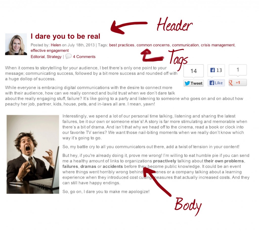
Take a ZN blog post for example, which also has basic hierarchy elements: the header is on top, below are the tags, and under that we find the body of the article.
When categorizing content on a website, thought also needs to be put on the hierarchy of possibly dozens of elements – such as a search app, related CTA, unrelated promotion, advertisements. There may also be a need to break down the content into different types, like detailed content, overview, and quick facts.
Mobile first
After all this, we can then start… on mobile first.
Beginning with the smallest grid – the one column view for the narrowest screens – we determine where these different types of content should lay.
However, this shouldn't mean that users who access the site on a mobile phone wouldn’t be able to access all the content. With a well-built, responsive navigation structure and a good content strategy, the mobile web design can achieve content parity, where the elements of a site remain accessible on any device.
Prioritizing the mobile context forces designers and content providers to focus on the core information and functionality. When you have this all sorted and nailed down for mobile, constructing the rest of your grids becomes easier and will make more sense.
There’s no quick fix
Understanding the content in the smallest possible level; developing the links, tagging, and relationships between different types of content (and seeing these on a semantic level), are the steps you need to take to create future-ready content.
Responsive design is not a quick fix. It requires careful planning and solid execution, but the result pays off. There may be a new device in the works around the corner and your website as well as content must be ready.
Check back again soon to learn more about mobile strategy and to see what fits best for whom.
.


