I’m sure you’re already well aware of the growing importance of your online presence; failure to engage your online audience will impact your brand reputation and potential customers will simply look elsewhere. So, with more and more people using smartphones and tablets to access the Internet on the go, how do you ensure your audience can easily browse and navigate your website, whatever their device?
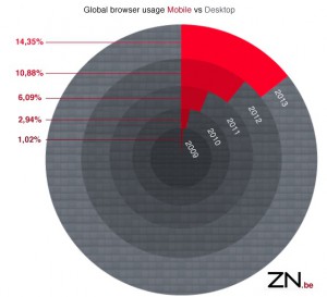
With the popularity of smartphones rising steeply and tablet shipments due to surpass portable PC shipments in 2013, this is one question you simply cannot ignore; the demand for smaller screen, touch-based mobile access to websites is accelerating year-on-year from 15% of website visits today.
Take Jerry, for example. In the office he accesses the Internet using his laptop, at home he uses his tablet and when on the move he uses his smartphone. He needs to be able to access any of your content at any time using any device.

Statistics taken from StatCounter Global Stats
Designing websites for mobile users
Firstly, when you’re designing websites for mobile users, understanding the audience’s needs is vital. The way Jerry interacts with a website depends on the characteristics of the device he’s using. For example, to view a web page on a small screen, he’ll need to pan and zoom extensively. And since touch-based devices – such as smartphones and tablets – don’t have a cursor, you need to be aware of the touch events (taps and drags, for example) that have a very different meaning to cursor events (left and right clicks, for example).
Before tablets arrived, websites were traditionally designed and developed separately for each type of device. Normally there were two sites: one for desktop access and a second for mobile devices such as smartphones.
The One Web approach
Then tablets brought a new approach: the One Web approach. This approach (which has been around for a few years) advocates open, device-neutral web content creation that gives audiences the same optimal viewing experience whatever their device. Today, the One Web approach comes in two flavors: the responsive web design approach (where web pages automatically proportion themselves to fit the device) and the adaptive web design approach (which includes a predefined set of page layouts matching different sizes).
Taken from: What The Heck Is Responsive Web Design? A scrolldeck.js presentation by John Polacek
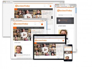
If you want to see an example of a website designed using the One Web approach, take a look at one we’ve recently developed here at ZN: vaccinestoday.eu.
Which approach: traditional or One Web?
No approach is better or worse than the other. Each has its strengths and its weaknesses. Focus on matching the benefits of each approach to your needs and then pick the one that helps you achieve your overall goal.
On the one hand, the traditional approach will ensure the mobile version of your website is optimized for mobile devices, but users using different types of devices cannot share links. On the other hand, the One Web approach ensures all consumers have the same viewing experience whatever their device. And from a developer’s perspective, the One Web approach simplifies both development and management.
|
|
Traditional approach |
One Web approach |
|
Number of websites |
One for desktops & one for mobile. May require others in the future as new device types (for example, smartTV) emerge. |
Just one. Automatically determines the size of the browser window. The layout and the size of the images adjust accordingly. |
|
Can links be shared across all types of device? |
No. If, for example, a mobile user shared a link with a desktop user, the mobile website would be displayed in the desktop browser. This would not look good. |
Yes. |
|
Website management |
Every modification needs to be implemented and uploaded for each website. |
Each modification is implemented and uploaded once. Website analytics and SEO are also easier. |
|
Handling new devices |
Developers must make changes each time a next-generation device or browser is released. |
Automatically detects and adjusts for new devices or browsers. |
|
User experience |
Allows design and content to be optimized specifically for mobile users. |
Users have the same experience whether they are opening a site in full resolution, on a smartphone, tablet or e-reader. |
|
Speed |
In many cases, loads faster thanks to less content and optimization. |
If the website has limited navigation but extensive content, pages may take longer to load. |
The challenge of mobile apps
Mobile apps are also becoming increasingly popular in parallel to the growing uptake of tablets and smartphones; they allow companies to offer clients access to the same applications as on their desktop, but on the move. But developing and maintaining different versions of each app for each of today’s popular mobile platforms – iOS, Android and Windows 8 – can be complex and time consuming.
A browser-based technology called HTML5 will allow one version of each app to be developed for all mobile platforms. This technology will be able to provide the consumer with the same rich experience that the native mobile apps deliver today, while making life easier for developers.
Again, the key to success lies in understanding your users and their needs, and picking an approach that best helps you achieve your goals.
The key to success is in knowing your audience
Here at ZN, we can’t emphasize strongly enough how important it is to keep adapting. As responsive web design has been around for a few years, we encourage you to make your website future-ready. Whether you want to develop apps, websites or an overall mobile strategy, gaining insights into your audience and their needs before making any decisions is crucial.


