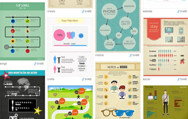
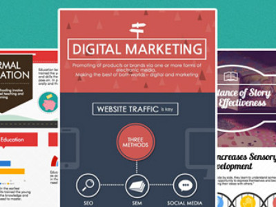
Want to get the most out of your virtual identity? Why not present your “raison d’être” in a visual and compelling digital format to achieve brand recognition and get your audience talking? Knowing that 40% of people respond better to visual information than text and that people prefer more dynamic content formats, infographics can be a great way to get your message across.
And there are easy ways to create infographics from scratch if you don’t have the budget or are short on time.
4 easy steps
- Research on an inspirational topic: only collect the basic data to develop your idea (the visuals, the content, and the knowledge).
- Allow the data to form perspective: shape a creative concept that will keep the attention of web users, keep it simple and try to avoid using too many words.
- Visualize enough information to tell your story: a combination of graphics, design, style, and format will help you along. Don’t forget to provide statistics, create a nice narrative flow, and choose the right colors that match your corporate brand.
- Tweak it, tweak it, and tweak it: until you strike the perfect balance between education and promotion.
3 great online tools
So you went through the 4 steps. Great! But you aren’t a natural-born graphic designer? Not to worry, there’s an array of tools available online that will help you make easy infographics.
Here’s our top 3 picks for beginners (and non-beginners).
Easel.ly
 Choose from different predefined designed themes; customize background color and format; add your text; choose geometrical shapes such as arrows, lines, circles; select objects from different categories (people, animals, icons…) to complement your text. You can also add charts or upload any image or logo and drag it wherever you want. The grid feature allows you to place your words and images exactly where you want it, and having layers makes it easy to manipulate various elements. You can edit everything and anything!
 Piktochart
According to our very own Carlos Chaves: “My first impression when I first opened piktochart was that the predefined templates they offer allows you to organize information in a neat way. If you aren’t a born designer, the complicated task is to put all the content and knowledge in a document and make it look nice and cozy. The way you can place and move the objects around is very convenient, easy, and fast. Plus, adding information on the graphics is simple. After playing with the tool for 45 minutes, I was pleased with the results!”
 Infogr.am
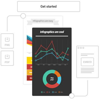
Offers users a nice selection of charts, maps, and graphs. The platform is in an easy-to-use format that can have you making dynamic visuals that you can share with your audience in no time. The user account set up is free of charge and that gives you access to over 30 chart templates to choose from. In a snap, data can be imported from xls/xlsx and your infographic can be published and shared online. If you want to download your work and have it branded and published elsewhere, you’ll have to pay to get rid of Infogr.am’s watermark.
Good for B2B/B2C/H2H
Still not convinced about the value of infographics? According to ansonalex.com, publishers who use infographics grow in traffic an average of 12% more than those who don’t. Once you create a meaningful/funny/informative infographic, your audience is more likely to share it with others. And that helps more people find your site and see your value. The fact is people seem to gravitate more toward visual content than text.
Try out these tools and let us know how creative you get. And don’t forget to share your infographics with us!
[vfb id=’1′]


